Interpretation of the Design Connotation of NIDA Logo
The Global Alliance for Fixed Network Innovation (NIDA) last year upgraded and designed a brand new logo. The new logo is not only a visual language reshaping, but also a profound expression of the brand's core value and future strategic direction. The following is a detailed explanation of the logo design:
01 Continue the brand gene, inherit and innovate at the same time
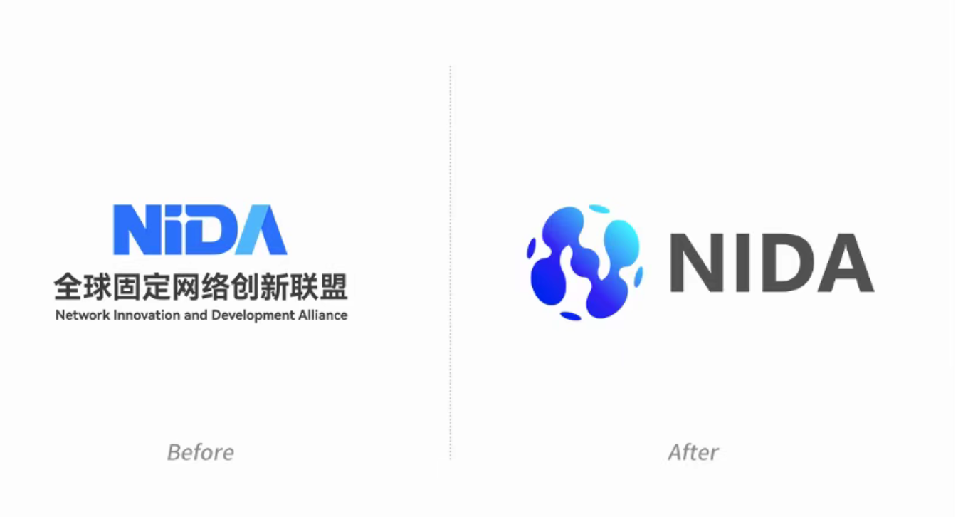
NIDA's original logo is based on four letters, using positive and negative spaces to create a visual effect of the light of technology between "i" and "D". The design embraces the spirit of innovation and the future, while using a cross-shaped metaphor for local close-ups of network connectivity, delivering the brand concept of connectivity and high-speed broadband experience. In designing the new logo, we continue the essence of the brand's genes, ensure that its core concept is passed on, and incorporate more dynamic and open elements to meet the rapidly evolving industry ecosystem and global market needs.
02 Liquid form: A symbol of dynamics and flexibility

The main body of the new logo is designed in an organic liquid form. This design language not only symbolizes the fluidity of data, but also embodies the dynamic nature of information transmission and the real-time nature of network connection. This sense of fluidity shows the nature of the network moving freely in the multi-dimensional space, but also implies the adaptability and flexibility of NIDA in the face of the rapidly changing industrial environment.
This concept, which breaks through the traditional linear design, not only shows the dynamic interaction of data flows on the network, but also reflects NIDA's leading position in the "new Internet" experience upgrade: faster connections, smarter networks, stronger security, and wider application scenarios.
03 Globalization of the Network: Dots and lines construct three-dimensional "N"

Another key design highlight of the new logo is the combination of dots and lines to create the three-dimensional letter "N" on the surface of the sphere. This design not only directly reflects NIDA's brand identity, but also conveys its openness as a global international alliance through visual language.
The three-dimensional "N"-shaped structure conveys multiple meanings: Open organizational structure, standardization capability for global industry promotion, and flexible coverage capability for various scenarios This design language contains deep meaning in conciseness, and presents complex information through concise graphics, which not only facilitates identification, but also enhances the international image of the brand.
04 Key points: Convergence of technologies and services

When designing the letter "N", we specially incorporated the core business of NIDA - the innovative exploration of four scenarios: joint computing, joint intelligence, joint data, and joint air. These four key points run through the four technical directions of the new Internet:
New • ultra-broadband connections: Faster network speeds and more stable connections.
•IPv6+ New Extensions: Promote the upgrade and wide application of network protocols.
New intelligence in • networks: Efficient allocation and optimization of network resources through intelligent technology.
New • security mechanism: Build a more advanced and reliable network security protection system.
By integrating these technical directions, we hope to reflect NIDA's core path in the logo design and demonstrate its technical leadership and foresight in the new Internet field.
05 Cooperation and openness: Ingenious integration of two-handed metaphors

In the design, we cleverly incorporate two-handed metaphors to symbolize NIDA as an international alliance of openness and cooperation that connects global innovation forces to drive the advancement of network technology. This detail not only enriches the connotation of the graphics, but also adds a layer of humanistic concern to the logo.
06 Blue Gradient: Wisdom and Modern Visual Expression
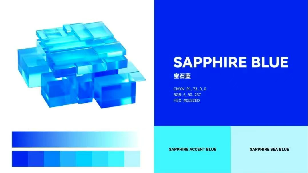
In the color selection, we choose the sapphire blue gradient, from deep blue to light blue gradient transition, not only convey the wisdom, trust and stability of the brand core values, but also endow the logo with a modern sense and vitality. Dark blue symbolizes professionalism and reliability, while light blue adds a touch of youthful innovation. This gradient color treatment not only enhances the brand's visual impact, but also provides strong support for its modern and international image.
07 Stereo Design: Metaphors of Ascending Dimensional Thinking
Although the new logo is a graphic design, it creates a strong three-dimensional feel through the combination of dots and lines and flow patterns. This design approach not only enhances the visual impact, but also metaphorizes NIDA's upward thinking in the field of new Internet technologies: Comprehensive innovation from a single dimension to a multi-dimensional dimension and from a part to a whole. This concept of "upgrading dimension" is a true reflection of NIDA's continuous breakthrough in the industry and leading the future.
08 The designer has something to say: Design enablement brand future
Co-entropy Service Center, as the design organization of the new logo of NIDA, hopes to inject new vitality and depth into the brand of NIDA through this brand-new logo. It is not only an update of visual symbols, but also a condensed expression of the brand's core values and future vision.
With this new design, NIDA not only consolidates its position at the heart of global network innovation, but also conveys to the world its relentless pursuit of innovation, collaboration and technological excellence. We are confident that this logo will be an important milestone in the development of the NIDA brand and will continue to shine on the global stage of the future.
Logo design organization: COMENTROPY INDUSTRY AND STANDARDS INNOVATION SERVICE CENTER
Previous:NIDA Network Evolution WG: Exploring the Path to Future Networks
Next:No more
