NIDA has a new logo!
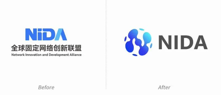
Network Innovation and Development Alliance (NIDA) recently launched a brand new logo, which is not only a visual update, but also a profound reflection of the brand's philosophy and strategic direction. The design of the new logo continues the original brand gene, but also introduces more innovative elements to adapt to the rapidly changing industrial environment and global market demand.

Interpretation of the Original Logo Design

The original NIDA logo is based on four letters and cleverly uses the design technique of positive and negative space to form the visual effect of the light of technology between "i" and "D", implying innovation and future. The cross-shaped design, which resembles a partial close-up of network wiring, symbolizes connectivity in the Internet world and the smooth and seamless ultra-fast broadband user experience it brings.
In-depth analysis of the new logo design

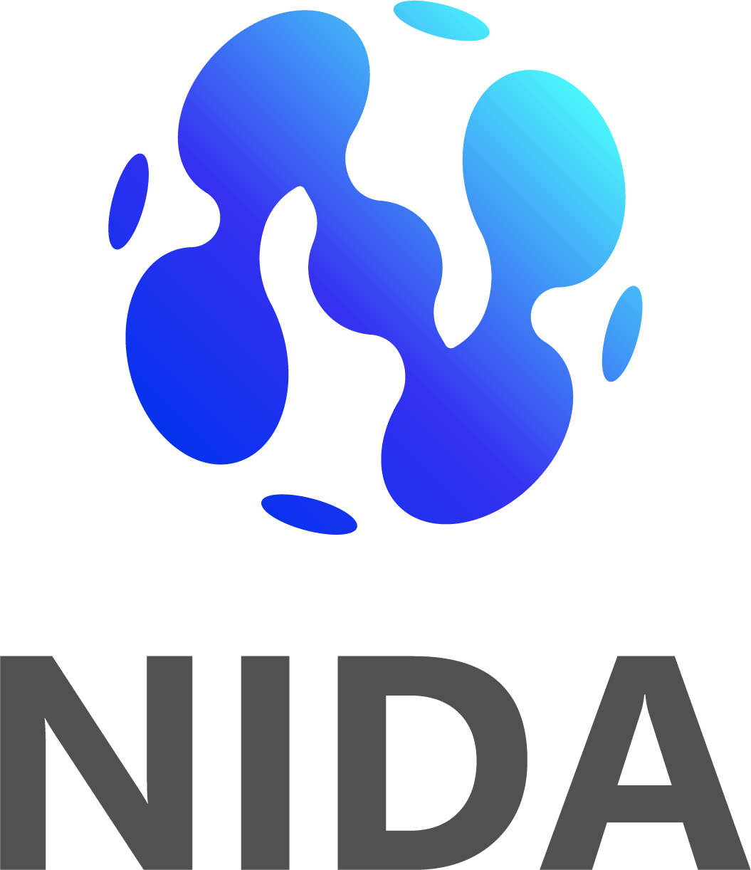
The new logo is designed to break the tradition by using organic liquid shapes connected to the body shape, which symbolizes the fluidity and connectivity of data and the dynamics of data flow and information delivery. Reflects the new quality of the Internet in terms of experience upgrade.
At the same time, this fluid pattern symbolizes NIDA's adaptability and flexibility in a rapidly changing industrial environment.
Further, the new logo forms the letter "N" on the surface of a sphere in the form of "dots" and "lines". This not only showcases NIDA's image as a global alliance of nations, but also conveys several layers of meaning through the open design in the graphics: NIDA's open organizational structure, standards for global industry promotion, and more flexible scenario coverage capabilities.
The letter "N" consists of four key points, which reflect the four business scenarios of the new quality Internet: joint computing, joint intelligence, joint data, and joint air. Innovatively proposed four new technology directions: ultra-broadband new connections, new IPv6+ expansion, new network intelligence, and new security mechanisms.
In addition, the two-handed design in the logo emphasizes NIDA as a collaborative and open alliance.
Finally, although the design is a graphic design, it gives a three-dimensional sense in the visual sense, implying NIDA in the field of new quality Internet technology promotion thinking.
Color and visual communication
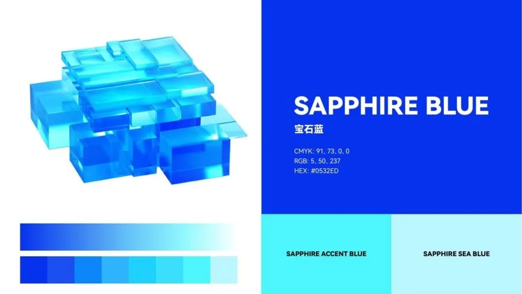
The ruby blue gradient color of the new logo further enhances the brand's visual impact. Blue is often associated with intelligence, trust and stability, and the use of dark blue and light blue not only represents NIDA's professionalism, but also adds a sense of modernity and vibrancy. The choice of this colour certainly strengthens NIDA's brand image as a reliable and professional group.
Conclusion:
NIDA's new logo is an important milestone in the evolution of its brand. It is not only a visual symbol update, but also a comprehensive demonstration of the brand's core values and vision for the future. Through this logo upgrade, NIDA not only strengthens its position at the heart of global network innovation, but also conveys to the world its relentless pursuit of innovation, collaboration and technological excellence.

